| Author |
Message |
    
buelliedan
| | Posted on Tuesday, February 26, 2002 - 04:00 pm: | 


|
I vote for #20. |
Eeeeek
| | Posted on Tuesday, February 26, 2002 - 04:16 pm: |
|
Judy will have problems with #20. Trust me.
Vik |
Lake_Bueller
| | Posted on Tuesday, February 26, 2002 - 06:05 pm: |
|
I like #20 but the mother company may have a problem. #16 is second and #10 is third. |
Anonymous
| | Posted on Tuesday, February 26, 2002 - 07:09 pm: |
|
I like # 1 and #16 
R |
Ocbueller
| | Posted on Tuesday, February 26, 2002 - 07:09 pm: |
|
How's about a combination of 10 and 16?
SteveH |
Peter
| | Posted on Tuesday, February 26, 2002 - 07:33 pm: |
|
Ditto.
10 & 16.
PPiA |
V2win
| | Posted on Tuesday, February 26, 2002 - 08:06 pm: |
|
3,10, or 16 |
Kahuna
| | Posted on Tuesday, February 26, 2002 - 08:20 pm: |
|
Definitely 16 |
Court
| | Posted on Tuesday, February 26, 2002 - 08:36 pm: |
|
16 |
Raymaines
| | Posted on Tuesday, February 26, 2002 - 10:26 pm: |
|
#1 or 16, I can't tell them apart --- And not only that but I'm voteing 10,000 times so I'm going to win. Nener, nener, nener. |
Jim_Witt
| | Posted on Tuesday, February 26, 2002 - 10:33 pm: |
|
Blake Wow,
Tough one;
Number 10 is actually pretty cool. Goes with the theme of the BBS and all, but really isn't a LOGO. Maybe you could intergrate it somehow into the Webpage.
Logo wise I like 1 or 16. The again 4 and 20 would be my next choice.
Maybe YOU should narrow them down after everyone makes their choices.
S'later,
-JW:>) |
Bluzm2
| | Posted on Tuesday, February 26, 2002 - 10:52 pm: |
|
I'll pitch another one in for 16. Simple but to the point.
Although I do kind of like the lightning bolt farting Pegasus! |
Rall
| | Posted on Tuesday, February 26, 2002 - 11:03 pm: |
|
#20 is by far the Best
Mark |
Eeeeek
| | Posted on Tuesday, February 26, 2002 - 11:43 pm: |
|
Trust me on this one: #20 will not fly. I received a little friendly advice not to go forward with this design a little while back.
 |
Roc
| | Posted on Wednesday, February 27, 2002 - 01:59 am: |
|
Sell 21 and some factory version of the pegasus as a package deal, should they happen to be placed togeather. 3 and 10 are the best, to busy for a patch/sticker though. |
Sparkypdx
| | Posted on Wednesday, February 27, 2002 - 03:33 am: |
|
#16 is the best. #13 has a future.
Jon J. |
Sybren
| | Posted on Wednesday, February 27, 2002 - 05:12 am: |
|
I like nr. 12 for its simplicity, but it does need some work. Right now it is too nice. |
Pilot
| | Posted on Wednesday, February 27, 2002 - 05:32 am: |
|
16 16 16 16 16 16 16 16 16 16 16 16 16 16 16 16 16 16 16 16 16 16 16 16 16 16 16 16 16 16 16 16 16 16 16 16 16 16 16 16 16 16 16 16 16 16 16 16 16 16 16 16 16 16 16 16 16 16 16 16 16 16 16 16 16 16 16 16 16 16 16 16 16 16 16 16 16 16 16 16 Yeah I think no 16.should be the number. |
Court
| | Posted on Wednesday, February 27, 2002 - 06:27 am: |
|
20 will elicit letters from Michigan. |
Loki
| | Posted on Wednesday, February 27, 2002 - 08:56 am: |
|
muh nickles worth
I have liked #1/#16 from the start, but would be hard to carry out as a patch. Would work as a decal though
#12- good window cling
#13- in a small size it would work as a decal for a helmet. Easy to carry out patch on a dark background with an offsetting color for a border
#21- good bumper stickers(are they not kinda passe though) but would be perfect for tagging the neighbors cars.....
Might need to pick a couple for different uses |
Xgecko
| | Posted on Wednesday, February 27, 2002 - 10:29 am: |
|
#16 is good...I like the pegasus but I can see why they "Mother Company" wouldn't approve...gotta protect the image or anyone can use it. |
Vasistass
| | Posted on Wednesday, February 27, 2002 - 10:54 am: |
|
Just one Idea ...

Here is the logo of our club
 |
Vasistass
| | Posted on Wednesday, February 27, 2002 - 11:08 am: |
|
The responsible on HD&Buell Belgium refuse us to use the BUELL name!! Otherwise we can pay a lot for using it.
It's the most stupid thing I've ever heard ...
If we make a club for BUELL ... it's because we are PROUD to drive a BUELL !!!!
So, our message is "BUELL IS GREAT" !!
So, why can we use the name ????? |
Blake
| | Posted on Wednesday, February 27, 2002 - 02:24 pm: |
|
The current entries (again)...
1. 
2. 
3. 
4. 
5. 
6. 
7. 
8. 
9. 
10. 
11. 
12. 
13. 
14. 
15. 
16.
17. 
18. 
19. 
20. 
21. 
22.
FYI: (1) and (16) are the same.  |
Blake
| | Posted on Wednesday, February 27, 2002 - 02:32 pm: |
|
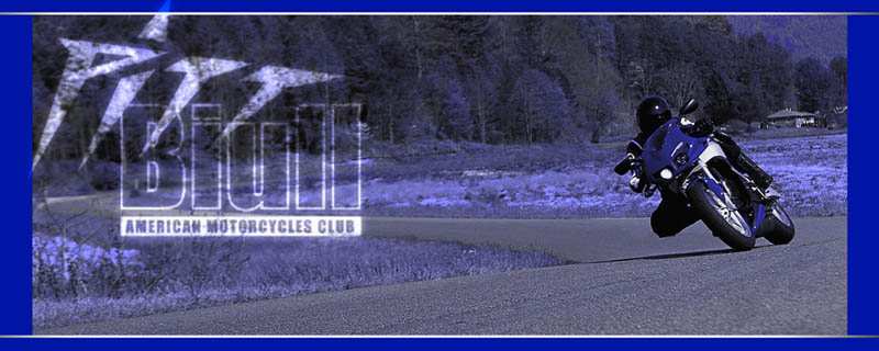
Eeeeek: That logo ROCKS!!! I recall seeing it a while ago and thinking to myself "damn, that would be a great logo theme for BadWeB too." You gotta figure some sort of variation on that theme. Too cool!
I'd like 15 if it had the words/letters in true mirror image and of course the proper web addresses. Not sure if the mother ship would approve of the left hand lense part though. |
Xgecko
| | Posted on Wednesday, February 27, 2002 - 03:21 pm: |
|
#16 would make a good patch if you dropped the shading and just had blue and silver. Here is a fast cleanup
 |
Jvv
| | Posted on Wednesday, February 27, 2002 - 03:37 pm: |
|
16 and 20 both cool......can I vote twice??????.....16 may also get some raised eyebrows..........what about red/white/blueing #11 with some back legs??
Vic.....I wondered why the logo your never went forward..........you would think that "a friend of the corp. (revolkable *sp* anytime/anyreason) status".......could be worked out????? |
Jima4media
| | Posted on Wednesday, February 27, 2002 - 04:10 pm: |
|
I like 16 - it's simple and ties in nicely with Buell's current logo without infringing, and could be made into a patch.
Jim
X-2.5 |
Spike
| | Posted on Wednesday, February 27, 2002 - 04:32 pm: |
|
Blake, What's the deal with 1 and 16? I made them (along with 12, 13, and 15) and even I can't tell the difference. Did you mean to put a different one up there?
Spike
'99 Cyclone |
Eeeeek
| | Posted on Wednesday, February 27, 2002 - 05:58 pm: |
|
Look for something to happen with a variation of my design (truth me known, Chop did the lettering, I did the guy on the bike and Paul in Oz did the shadow and Pegasus). Now that the SACBORG store is live, you'll probably see a corporate friendly version as soon as this weekend
Oh yeah, my vote is for 16, too. Wait, 1. No, 16!
Vik |
 Logo for BadWeatherBikers.com? »
Archive through February 27, 2002
Logo for BadWeatherBikers.com? »
Archive through February 27, 2002