G oog le Buell 1125R Forum | Login/out | Topics | Search | Custodians | Register | Edit Profile


Buell Forum » 1125R Superbike Board » Archives 001 » Archive through October 16, 2009 » And now for something slightly different « Previous Next »

Author Message
Top of pagePrevious messageNext messageBottom of page Link to this message

Ohbuellman
Posted on Saturday, October 10, 2009 - 06:56 pm:   Edit Post Delete Post View Post/Check IP Print Post    Move Post (Custodian/Admin Only) Ban Poster IP (Custodian/Admin only)

There has already been a fair amount of discussion regarding the fairings, but I thought I'd share what they look like on the arctic white & blue bike painted to match.

Took me a while to get used to the "pods" but they grew on me after a while. But, I'm also happy with the way the fairings came out too.

What do ya think??
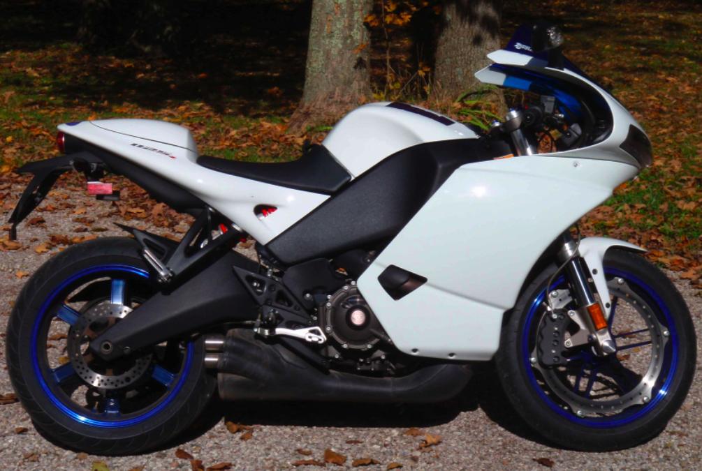

1125R with white fairings
Top of pagePrevious messageNext messageBottom of page Link to this message

Jelomadnes
Posted on Saturday, October 10, 2009 - 07:23 pm:   Edit Post Delete Post View Post/Check IP Print Post    Move Post (Custodian/Admin Only) Ban Poster IP (Custodian/Admin only)

Nice
Top of pagePrevious messageNext messageBottom of page Link to this message

Bob_thompson
Posted on Saturday, October 10, 2009 - 07:32 pm:   Edit Post Delete Post View Post/Check IP Print Post    Move Post (Custodian/Admin Only) Ban Poster IP (Custodian/Admin only)

Really nice Brian and just begging for a couple of Buell Pegasus stickers on each side.
Top of pagePrevious messageNext messageBottom of page Link to this message

Gschuette
Posted on Saturday, October 10, 2009 - 08:15 pm:   Edit Post Delete Post View Post/Check IP Print Post    Move Post (Custodian/Admin Only) Ban Poster IP (Custodian/Admin only)

Eh it looks incomplete without a bellypan.
Top of pagePrevious messageNext messageBottom of page Link to this message

Zac4mac
Posted on Saturday, October 10, 2009 - 09:54 pm:   Edit Post Delete Post View Post/Check IP Print Post    Move Post (Custodian/Admin Only) Ban Poster IP (Custodian/Admin only)

I think that looks good with the OEM exhaust.
Top of pagePrevious messageNext messageBottom of page Link to this message

Donutclub
Posted on Sunday, October 11, 2009 - 09:42 am:   Edit Post Delete Post View Post/Check IP Print Post    Move Post (Custodian/Admin Only) Ban Poster IP (Custodian/Admin only)

I've seen in person on Brian's bike and they do look good. I think they look better on the white bike than the black.
Top of pagePrevious messageNext messageBottom of page Link to this message

Sleeper_777
Posted on Sunday, October 11, 2009 - 09:44 am:   Edit Post Delete Post View Post/Check IP Print Post    Move Post (Custodian/Admin Only) Ban Poster IP (Custodian/Admin only)

very nice, now for the artwork on that canvas.
Top of pagePrevious messageNext messageBottom of page Link to this message

Bishopjb1124
Posted on Sunday, October 11, 2009 - 10:38 am:   Edit Post Delete Post View Post/Check IP Print Post    Move Post (Custodian/Admin Only) Ban Poster IP (Custodian/Admin only)

Powdercoat your muffler white to balance it out.


Jimmy
Top of pagePrevious messageNext messageBottom of page Link to this message

Xb9er
Posted on Sunday, October 11, 2009 - 12:01 pm:   Edit Post Delete Post View Post/Check IP Print Post    Move Post (Custodian/Admin Only) Ban Poster IP (Custodian/Admin only)

Looks nice. I really like the arctic white 1125's. Oh yeah and dont powdercoat your pipe white
Top of pagePrevious messageNext messageBottom of page Link to this message

Stevasaurus
Posted on Sunday, October 11, 2009 - 12:10 pm:   Edit Post Delete Post View Post/Check IP Print Post    Move Post (Custodian/Admin Only) Ban Poster IP (Custodian/Admin only)

I think they look better on the white bike than the black.

+1
Top of pagePrevious messageNext messageBottom of page Link to this message

Geforce
Posted on Sunday, October 11, 2009 - 12:57 pm:   Edit Post Delete Post View Post/Check IP Print Post    Move Post (Custodian/Admin Only) Ban Poster IP (Custodian/Admin only)

Great job! Looks really good! Any plans for graphics or stickers or logos or anything?
Top of pagePrevious messageNext messageBottom of page Link to this message

Badlionsfan
Posted on Sunday, October 11, 2009 - 01:04 pm:   Edit Post Delete Post View Post/Check IP Print Post    Move Post (Custodian/Admin Only) Ban Poster IP (Custodian/Admin only)

I agree with Bishop, powdercoat that muffler white and you'll really be onto something.
Top of pagePrevious messageNext messageBottom of page Link to this message

Imonabuss
Posted on Sunday, October 11, 2009 - 02:01 pm:   Edit Post Delete Post View Post/Check IP Print Post    Move Post (Custodian/Admin Only) Ban Poster IP (Custodian/Admin only)

I like it! I might add some graphics to the fairing, but I wouldn't paint the muffler white. A bellypan would be nice, but not needed, the Japanese OE superbikes mostly don't have belly pans, just fairing lowers. The 1125 needs lowers; I think it makes a huge difference.
Top of pagePrevious messageNext messageBottom of page Link to this message

Court
Posted on Sunday, October 11, 2009 - 02:10 pm:   Edit Post Delete Post View Post/Check IP Print Post    Move Post (Custodian/Admin Only) Ban Poster IP (Custodian/Admin only)

The new Black and White Buell logo might look nice on that bodywork . . . nice.
Top of pagePrevious messageNext messageBottom of page Link to this message

Pariah
Posted on Sunday, October 11, 2009 - 02:21 pm:   Edit Post Delete Post View Post/Check IP Print Post    Move Post (Custodian/Admin Only) Ban Poster IP (Custodian/Admin only)

It looks good...
Top of pagePrevious messageNext messageBottom of page Link to this message

Thespive
Posted on Sunday, October 11, 2009 - 02:59 pm:   Edit Post Delete Post View Post/Check IP Print Post    Move Post (Custodian/Admin Only) Ban Poster IP (Custodian/Admin only)

Needs a white or black belly pan, not a white muffler.

--Sean
Top of pagePrevious messageNext messageBottom of page Link to this message

Blake
Posted on Sunday, October 11, 2009 - 04:14 pm:   Edit Post Delete Post View Post/Check IP Print Post    Move Post (Custodian/Admin Only) Ban Poster IP (Custodian/Admin only)

Painting the muffler white would cause it to become a focal point. That's not the part of the bike I'd want being a focal point.

Full lowers (covering muffler) would look good.
Top of pagePrevious messageNext messageBottom of page Link to this message

Ridenusa4l
Posted on Sunday, October 11, 2009 - 04:25 pm:   Edit Post Delete Post View Post/Check IP Print Post    Move Post (Custodian/Admin Only) Ban Poster IP (Custodian/Admin only)

not to mention that it would probably get VERY discolored over time, and end up lookin brown..

Jake

BTW- looks great, but i agree with a belly pan and it would be spot on ; )
Top of pagePrevious messageNext messageBottom of page Link to this message

Xb9er
Posted on Sunday, October 11, 2009 - 05:50 pm:   Edit Post Delete Post View Post/Check IP Print Post    Move Post (Custodian/Admin Only) Ban Poster IP (Custodian/Admin only)

A blue belly pan with BUELL in white letter. Kinda like how the cbr's say honda down low for a mental picture. I'm just sayin.......
Top of pagePrevious messageNext messageBottom of page Link to this message

Oddball
Posted on Sunday, October 11, 2009 - 08:03 pm:   Edit Post Delete Post View Post/Check IP Print Post    Move Post (Custodian/Admin Only) Ban Poster IP (Custodian/Admin only)

I think the Buell Racing logo goes better with white than the new black shield.
Top of pagePrevious messageNext messageBottom of page Link to this message

Ohbuellman
Posted on Monday, October 12, 2009 - 08:23 pm:   Edit Post Delete Post View Post/Check IP Print Post    Move Post (Custodian/Admin Only) Ban Poster IP (Custodian/Admin only)

Thanks for all the comments. I agree with the artwork idea. I have 8-inch blue Pegasus logos on order for each side. I designed these on Photoshop using company logo. I think that will look better than the black shield decal. A belly pan might look good too (blue with white lettering is a cool idea). I can't see powder coating the muffler white though b/c this is always dirty as it is and I'm not sure how I would ever keep it looking good.
Top of pagePrevious messageNext messageBottom of page Link to this message

Ratgin
Posted on Thursday, January 14, 2010 - 12:03 pm:   Edit Post Delete Post View Post/Check IP Print Post    Move Post (Custodian/Admin Only) Ban Poster IP (Custodian/Admin only)

A blue belly pan

« Previous Next »

Add Your Message Here
Post:
Bold text Italics Underline Create a hyperlink Insert a clipart image

Username: Posting Information:
This is a public posting area. Enter your username and password if you have an account. Otherwise, enter your full name as your username and leave the password blank. Your e-mail address is optional.
Password:
E-mail:
Options: Post as "Anonymous" (Valid reason required. Abusers will be exposed. If unsure, ask.)
Enable HTML code in message
Automatically activate URLs in message
Action:

Topics | Last Day | Tree View | Search | User List | Help/Instructions | Rules | Program Credits Administration