| Author | Message | ||
Johnnymac |
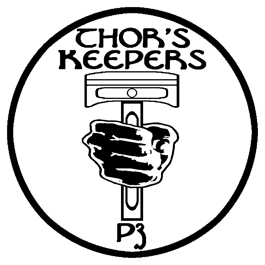
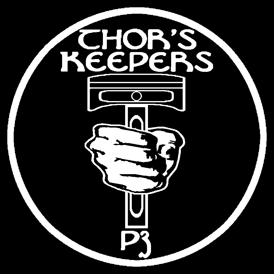
I would be happy to sign up for patches if you were using a different graphics for it. I don't like how the hand is holding the piston in the one you are using. I had created the one you are using by cleaning up the original design but had since refined it further. Here is a link to the current version in high-contrast which should yield better results when embroidered or printed:   Use which you like. I will just make my own if you decide to go with your original graphic. If you decide to use one of the above attached let me know and I will gladly buy into your purchase. Johnny  | ||
Conwaybrew |
The new graphic is very clean - I like it. I think I will update the T-shirts, etc. also if that's OK (since this is your artwork). Also, as the designer, are you OK with selling off some additional patches through other sources to keep our costs down? I obviously don't own the artwork so I want to ask the right person. | ||
Damnut |
Just found this thread. If you are looking for a vendor to do patches, I'll contact my friend ScottyJ from the NEBO group. He has a contact that did the NEBO, BWB & a few other group's patches. I'm pretty sure he got a good deal on them. Let me know if your interested and I can get the info. | ||
Johnnymac |
I'd be honored if my tweaked graphics were used. | ||
Johnnymac |
Count me in for at least 2 or 3 of the 3" patches. Some high quality vinyl stickers would be nice too. Johnny | ||
Fast1075 |
I'm ready to buy some... | ||
Crackhead |
any change the P3 could be made to look a little bit more like the big end of the connecting rod? | ||
Themagster |
Thanks Conway - I will be ordering a shirt soon. I appreciate your quick action. I'd love to see BWB on the back but don't know if you have the option to do that. P3 - lives on... | ||
Gearheaderiko |
Anytime you want me to PayPal, I'm ready and good for up to 10 patches  unless work derails your plans (if it wasnt for work I could get so much more done). unless work derails your plans (if it wasnt for work I could get so much more done). | ||
Indybuell |
I'm still in for 5 | ||
Ezblast |
I'm in for 10. EZ | ||
Conwaybrew |
I am checking in with the vendor on the updated artwork - I think that the black would be very nice. . . It also matches the pegasus on my jackets already. :-) | ||
Ezblast |
Those are ok for stickers, but the original colors where better - blue black and grey - 3 tones makes it stand out more than 2 tones. EZ | ||
Conwaybrew |
Do we want to try and do blue and silver or black and silver like the old/current Buell colors? | ||
Gearheaderiko |
Colourblind! I thought Buell colours were Blue and ? Not real keen on Black and silver (new Buell colours) besides they are also 'Raiders' colours. Other than that I dont have much of an opinion. PS Not a 'football' fan, so I dont need any 'Raider Nation' hate mail! Unless you want to make them Arsenal red & white, but I think someone else uses those 'colours'  | ||
Britchri10 |
Manchester United? WHTID! Chris C | ||
Gearheaderiko |
MU? LOL! Well the WHU black and blue is very Buell! | ||
Britchri10 |
Unfashionable, small, surrounded by controversy, financial woes... WHU does compare well w/Buell.... later, Chris C | ||
Conwaybrew |
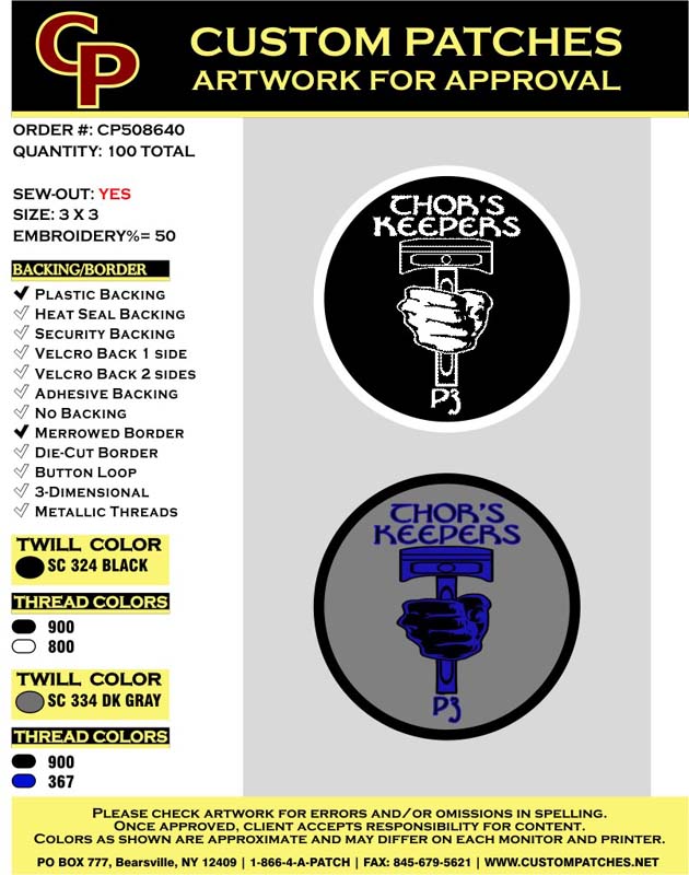
OK, artwork for approval. . . Final color decisions weighed. . . Anyone see any issues with the concept. . . Let me know, I can order next week if we agree on the design and colors.  | ||
Rainman |
I'm good. I'd buy some of both. | ||
Ezblast |
Sure - I'll take 5 of each, or if there is only one choice - then the blue and black is my choice. EZ | ||
Conwaybrew |
I would prefer to do one patch so that we can get a bigger discount on the costs. If we do two patches we won't get as good a deal on each. Votes? | ||
Indybuell |
Blue and Black I'd take a few. | ||
Rainman |
The blue black and gray goes best with my jacket and bike. Whatever everyone decides, I'm good with. | ||
Ezblast |
10 BLUE AND BLACK EZ | ||
Gearheaderiko |
Only 1 each vote EZ! I'm partial to the black and white, but I dont hate the black & blue. I do wonder if people will ask what a 'Chor' is! I wish the T was a little more 'T' like. | ||
Ezblast |
Chor is the work we do on Thor - lol EZ | ||
Rainman |
Hmm, I've got a couple of Thor chors to do when I get home. | ||
Britchri10 |
6 blue/black Chris C | ||
Gearheaderiko |
Somehow I knew you'd go for blue/black Chris  Also goes with The Hammer's logo Also goes with The Hammer's logo  |