| Author | Message | |||
Barker |
Dose anyone know what the Buell logo font is? Looking to do some lettering on my jacket. My name "BARKER" in the Buell font. | |||
Diablobrian |
haettenschweiler is the font I believe | |||
Cadman |
The BUELL font is IMPACT | |||
Diablobrian |
I hadn't gotten that far in the alphabet. The haettenschweiller is a better match. The Impace font e is too rounded, and the l's are too far apart. I had to do a close side by side to really get a good enough look at them. (Message edited by diablobrian on July 02, 2006) | |||
Diablobrian |
Try this:
| |||
Essthreetee |
I don't think it is either of those...the Haettenschweiller has little horns at the top of the B and L's. the Impact (to me) is CLOSER, but it needs to be squashed a little and the E is different... just my .02 Jason (Message edited by Essthreetee on July 02, 2006) | |||
Tq_freak |
I just looked at it and if you use the impact but in bold it is alot closer to the actual lettering then the haettenschweiler | |||
Just_ziptab |
Impact in bold is what I used and it matched perfectly to the tank decals on my X1.........   | |||
Rocketman |
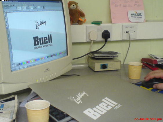
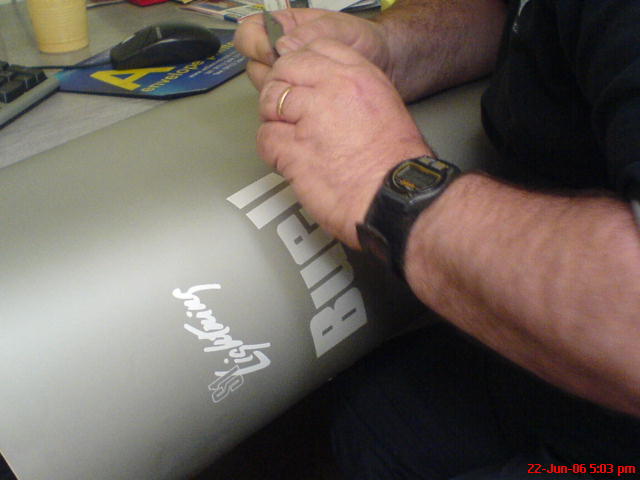
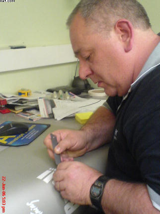
It's neither of those fonts. I'd go further and say Buell had the font designed. Depending on where you look on any official Buell product, there can often be slight differences in the font. The easy one to spot is the 'e'. Sometimes the 'e' is flat bottomed and flat topped, which is how it is on my S1W fuel tank. Other places, the 'e' is often round in shape. Two weeks ago my friend spent a lot of hours on the computer making a stencil to replicate the Buell font. Yes there are close, make that very close matching fonts, but not close enough for my liking. When the paint goes on there will be no stickers or transfers on my S1W. Everything will be painted on!   Rocket | |||
Josh_cox |
BUELL(r) FONTS MOTO BOLD should be used for all headline copy in marketing and communications pieces only. Always use this font in all caps and at a size no less than 10pt. Use the appropriate Mac or PC version of this font, depending on your computer platform. For all Buell body copy, use News Gothic - Buell's corporate font. This font may be used at a size no less than 5pt. and no greater than 12pt. ^^^This information is from Buell marketing material. These are the right fonts. | |||
Rocketman |
You mean this could have been done simpler Josh?  Rocket | |||
Brineusaf |
Buell did indeed have the font designed - according to my Columbus Institute of Art and Design contact. | |||
Rocketman |
We looked through hundreds of fonts, on several discs and on the net, and nothing matched perfect. In fact, every image we found from Googling 'Buell font' was wrong in some way or another. In the end Steve used a very high quality scanner to copy the image from a handlebar price tag I got years ago off a showroom Buell. Even then, despite the scanned material being very good to copy, a lot of work went into cleaning up the edges after viewing the fonts pixels close up. Getting the S1 Lightning logo was not easy. The only place I had it was on the front of the workshop manual, which is well oiled and well used lol. Cleaning the pixels on that one really pissed my friend off! The good news is, the first coat of paint went on this eve. Rocket | |||
Tramp |
holy "shave and a haircut", batman!  | |||
Josh_cox |
MOTO BOLD is the one Buell had designed. Every dealer received a copy of this font on a disc called Buell fonts. The other is a true type font anyone can buy. Neither of these are the ones with the flat e's like in thier logo though. These are used for there other texts. BTW if you need something without jaggies on the edges to make the Buell letters from, I can get you EPS files of the logos. (Message edited by josh_cox on July 06, 2006) | |||
Rocketman |
Well Josh that might be cool for another time. For now though Steve applied his skills and he got it sorted thanks. The stencil will be in use any day now. That's providing the bloody tank stops reacting with the primer! Incidentally, I called Steve and told him 'News Gothic'. He came up with 25 different fonts on the Mac but couldn't view them today as his Husky decided to give birth, so he left the print shop in a big hurry home! Rocket |