| Author | Message | ||
Jandj_davis |
I was looking at some photos of XB's (I think I am addicted) and I noticed that only the 9's have gay dash faces. The 9R has that stupid orange/yellow cartoon character crap, and the CityX has the same font in a less repulsive blue. However, the 12's have a sweet grey dash face. I recall someone making a template and putting different images on the dash face, but never saw anything from it. Did they ever put on a custom face? Was it difficult? Do you have to unseal the gauges to do it? | ||
Jandj_davis |
Dang it. I guess I didn't try the right combination of search words. Here is that thread. http://www.badweatherbikers.com/buell/messages/32777/188562.html But, there is still no resolution. Anyone? | ||
Drift |
I'm with ya. I have the City and I think the guage faces look gay. I would really like a new option. | ||
Chainsaw |
But, there is still no resolution. Anyone? A resolution besides providing a blank template for everyone, some sample dash artwork, and actually making one and using it for the past 4 months?  http://www.badweatherbikers.com/cgibin/discus/show.cgi?tpc=32777&post=630011#POS T630011 | ||
Diablobrian |
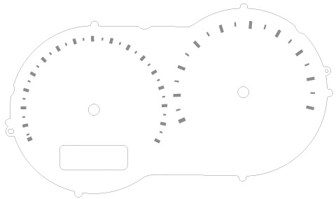
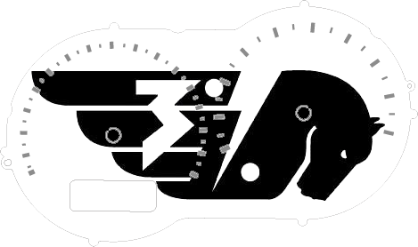
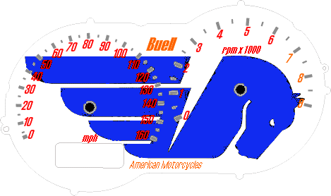
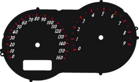
I made one and have been using it. I'm getting ready to make another. It's easy to do, the gages open easily with screws. You do have to be careful removing the needles and getting them back on in the proper place. removing the face is easy. you may have to fiddle with the scale of your image to get it to size with your printer. It's not bad and I got some positive comments on my black gage faces sans kph at homecoming. My next one will be white though with high contrast Black and grey markings. It'll be a fun project. Here are a couple of templates, not all are originals done by me. I believe some cleanup may be required on my little blue pegasus experiment.      (Message edited by diablobrian on August 03, 2006) | ||
Xbenign |
This topic caught my eye because I've often thought the speedometer was a little difficult to read because the numbers are to densely packed together. As long as you're redesigning dashes, does anyone know if it's possible spread the numbers out and make the current max of 160mph, oh say, 120mph and re-calibrate the speedometer accordingly? I never travel over 100mph and I think this would make the dash much more readable. | ||
Espcustoms |
You could just make a design with less numbers. Instead of every 10mph have the numbers for every 20 with just the tick marks in between for the tens. I've seen many car speedos done this way and it cleans it up a lot. | ||
Aatch |
i don't think i understand... are you printing these faces onto paper, and then somehow attaching the paper over the old dash face? that seems almost too low tech to be the case, so sure i must be missing something. I like the idea of being able to create your own dash, and diablobrian's designs are pretty cool - so please elaborate on how you are doing this....thanks! | ||
Pwnzor |
I'll be using waterproof glossy photo paper, and waterproof/UV resistant ink when I do mine.  (Message edited by pwnzor on August 03, 2006) | ||
Onemanclan |
Are you putting it over your existing face, or replacing it? | ||
Midknyte |
They are replacing them. A certain amount of transparency is needed for the backlighting. | ||
Diablobrian |
I used injet overhead transparency sheets, and UV stable ink, and a white onion-skin backing sheet over the stock gage face. Like I said, I'm not responsible for all of those designs. I was just re-sharing!  (Message edited by diablobrian on August 03, 2006) | ||
Onemanclan |
The designs are really cool, nice work..I'm thinking of stealing the flame one for my Uly...It'll look especially cool because it is black and I have taken off all the badging. My wife (reminder, graphic artist) says UV/Ultra II translucent printing paper works best...Thanks for sharing! | ||
Jandj_davis |
Does anyone have a high-res version of that template that is not in some goofy ghost-script format? | ||
Xbenign |
Does anyone have any experience with a product like this? http://www.trailtech.net/vapor.htm | ||
Sleez |
looks like a rip off of this; http://www.veypor.com/ although i don't really know which came first, but i've heard a lot about Veypor! | ||
Xbenign |
"Heard a lot" meaning good or bad? | ||
Midnightrider |
I'm more interested in changing the backlighting. The lamps are single unit LEDs with a plastic base/fitting. Has anyone found a colored replacement for these? |